How a picture becomes a knitting chart
Chart Minder exists because an old lady asked for three things: track her knitting progress, draw and save her charts, and import other people’s charts — from online, or from an electronic version. The first two asks are an editor. The third is an algorithm, and it is the most interesting code in the app.
The contract is strict. Input: a picture of a chart — a screenshot, a photo, a page rendered
out of a PDF. Output: a row count, a column count, and one yarn color per stitched cell, as a
document the editor opens like any other. Everything in between runs in the browser, over one
getImageData pass on one offscreen canvas.
Write the input as an image of width and height , with channel functions . The pipeline has four stages: find the lattice, sample each cell, reduce the sampled colors to a palette, and map the result into the chart’s own coordinate system. Each stage is a small piece of classical machinery, and each one has a literature behind it worth naming.
Stage one: the lattice, as two projection profiles
A chart’s grid lines are the strongest horizontal and vertical edges in the picture, and they are axis-aligned. That is enough structure to collapse a two-dimensional search into two one-dimensional ones. The detector accumulates the per-pixel forward difference into a column profile and a row profile:
with indices clamped at the right and bottom edges. Two classical ideas are stacked here. The inner sum is the approximation of gradient magnitude — the cheap stand-in for that image-processing texts recommend when the operation runs per pixel [6]. The outer sum is a projection profile: the technique that has carried document layout analysis since Nagy and Seth’s X–Y cut [1] and its recursive descendants [2], where summing ink along an axis turns “where are the columns of text” into “where are the valleys in a 1-D signal.”
Here the quantity being projected is edge energy rather than ink. A vertical grid line makes every pixel in its column disagree with the next column, so it contributes large terms to a single entry of . The motif’s own edges are scattered across many columns; the line’s are concentrated in one. In code, both profiles come out of the same loop:
1// imageImport.ts — one pass over the pixels fills both 1-D profiles.2const rowEdges = new Float32Array(height);3const colEdges = new Float32Array(width);45for (let y = 0; y < height; y++) {6 for (let x = 0; x < width; x++) {7 const idx = (y * width + x) * 4;8 const rightIdx = (y * width + Math.min(x + 1, width - 1)) * 4;9 const bottomIdx = (Math.min(y + 1, height - 1) * width + x) * 4;10 const diffX = Math.abs(data[idx] - data[rightIdx])11 + Math.abs(data[idx + 1] - data[rightIdx + 1])12 + Math.abs(data[idx + 2] - data[rightIdx + 2]);13 const diffY = Math.abs(data[idx] - data[bottomIdx])14 + Math.abs(data[idx + 1] - data[bottomIdx + 1])15 + Math.abs(data[idx + 2] - data[bottomIdx + 2]);16 colEdges[x] += diffX;17 rowEdges[y] += diffY;18 }19}The obvious alternative is the Hough transform [3], which finds lines at any angle by voting in parameter space. For an axis-aligned lattice that generality is all cost: Hough’s accumulator is two-dimensional per line family, while the projection profile answers the same question in time and space. Projection profiles buy their speed by assuming the grid is square to the frame, which is what “screenshot or PDF render” delivers and what the manual crop handles when a photo does not.
Peaks, and the gap between them
A grid line is a local maximum in the profile, so the peak set is
scanned left to right with a suppression rule that keeps a candidate only when pixels. The relative threshold makes the detector indifferent to exposure and contrast — what matters is a line’s height against the strongest line in the same picture. The suppression distance merges the twin spikes a single drawn line produces, one where paper meets line and one where line meets the next cell.
From the peak positions come the consecutive gaps , and from those the estimated cell size and the count:
The median is doing real work here, and it is worth saying why in the language of robust statistics. Real charts carry bold every-fifth lines, heavy borders, and lines faint enough to fall under — and a line that goes undetected merges two cells into one gap of roughly . The sample mean has a breakdown point of : a single arbitrarily large observation moves it arbitrarily far. The median’s breakdown point is , the maximum attainable for a location estimator [7, 8] — it is unmoved as long as most gaps are honest, which is exactly the failure model of a scanned chart.
A worked example makes the difference concrete. Rendering a 12 × 10 chart at 24 px cells with a bold line every fifth, ±3 per channel of scan noise, and one interior line omitted — a fold or a glare patch eating a line — the detector transcribed above finds twelve peaks in the column profile, spanning to , with gaps
The missing line leaves the bold 48. Then and
columns, which is right; while and
, which is wrong. One absent line is all it takes.
(The generator for that example lives with this site at
tools/grid-detect-worked-example/profile.mjs — it renders the image, runs the transcribed
detector over it, and prints every number quoted here.)
The final Math.round absorbs the ±1 px jitter in where individual peaks land, and and
give the crop rectangle, stored as fractions of the image so one rectangle survives
every preview scale.
Declining to guess
The detector returns null — no grid — when either axis yields fewer than three peaks or a
median gap of 2 px or less, and the app asks the user to place the grid by hand. A wrong guess
costs more than an honest shrug, because a plausible wrong guess is the one a user accepts
without checking.
That matters because the honest failure mode of a projection profile is plausible extra structure. Point the detector at an export that includes the chart’s title block, and the letterforms in that text pile up edge energy in the row profile in the same way a grid line does. The shipped app reads a certain 40 × 40 chart as 40 columns and 42 rows for precisely that reason. So both counts stay editable, the crop rectangle has drag handles on all four edges and corners, and the feature ships labelled Beta — the right interface for a method that is usually right and always checkable.
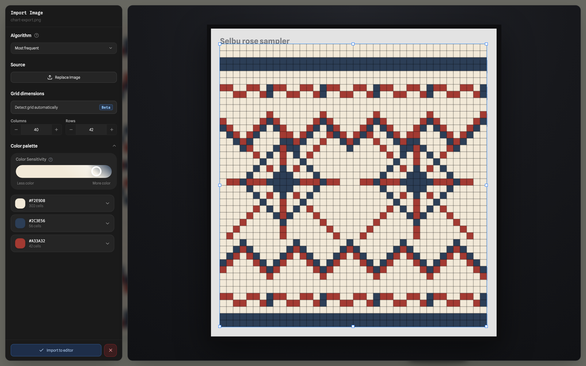
The importer pointed at a PNG the app itself exported: 40 columns exactly, and two extra rows where the title text’s edges peaked in the row profile. The blue crop rectangle and both count fields are there to be corrected.
Stage two: three estimators for one cell’s color
With the lattice placed as a fractional rectangle over the image, cell occupies the pixel rectangle whose origin is
Each origin is derived from the fractional coordinate and floored once, which bounds the rounding error at one pixel per cell. Stepping instead — — accumulates the fractional part: at px and 40 columns, the last cell would sit px off, two thirds of a cell, and the right edge of the chart would sample the wrong column entirely.
Only sufficiently opaque pixels are eligible, which is what keeps transparent PNG backgrounds out of the palette:
A cell with is skipped and imports as empty. The editor stores charts as a sparse dictionary with one entry per stitched cell, so emptiness is the representation’s resting state — transparency in, sparsity out, along the same code path every other empty cell takes.
Given , three estimators are offered, and the choice is a per-import setting:
The mean is right for vector exports, where a cell is one flat color and averaging cancels compression noise. The center pixel is the cheapest, and it is immune to grid-line bleed at the cell’s edges. The default is the third, a histogram mode: quantize each pixel onto a 10-step lattice, take the most populated bin, and average the pixels within it.
Quantizing is what lets noisy neighbours count as the same vote; averaging the raw pixels inside the winning bin afterwards is what keeps the answer off the lattice and on the yarn’s true shade.
Photographs are why the mode exists, and the argument is the same one the median won. Say a fraction of a cell’s pixels are dark grid line at value and the rest are yarn at . The mean returns — biased toward the line for every , which is the smeared, muddied import you get from photographing a chart. The mode returns exactly, for every . It is a 50%-breakdown estimator, like the median in stage one, and both appear here for the same reason: the contamination is a minority of the data, and large enough to drag an average well off the answer.
Stage three: the leader algorithm, and the k-means that stayed on the shelf
Sampling yields one color per cell, which on a photograph means hundreds of distinct hexes standing for what a knitter would call three yarns. The reduction walks the unique colors in descending order of cell count, and each color either joins the first family within threshold or founds a new one:
where is family ‘s center — the color that founded it. If exists, joins that family and adds its cell count; otherwise a new family opens with .
1// imageImport.ts, compressed to the decision. uniqueColors arrives sorted by2// cell count, descending: the chart's dominant colors found the families, and3// every rarer shade measures itself against those anchors.4const threshold = (100 - colorSensitivity) * 2;56for (const color of uniqueColors) {7 const family = families.find((f) => rgbDistance(color, f.center) <= threshold);8 if (family) {9 family.members.add(color.hex);10 family.count += color.count;11 } else {12 families.push({ center: color, members: new Set([color.hex]), count: color.count });13 }14}This is sequential leader clustering — Hartigan’s leader algorithm [4]. One pass, one threshold, cluster count discovered rather than declared, and results that depend on the order of presentation. That order dependence is usually listed as the algorithm’s weakness; here it is deliberately exploited. Sorting by descending cell count means the paper ground and the main yarns become leaders, and every rare shade — an antialiased edge, a compression artifact, a fleck of glare — measures itself against a color that genuinely occurs in the chart. The extracted palette is made of real colors from the picture rather than synthetic centroids.
The user’s sensitivity slider is the threshold:
At every distinct hex survives as its own family; near almost everything collapses into the first few anchors. The knob the user turns is the only parameter the algorithm has.
Why not k-means
The repository does carry a textbook Lloyd’s k-means in colorQuantization.ts — random
initialization, up to 20 iterations, empty clusters reseeded, converged duplicates deduped —
and the import path leaves it unwired. Its objective is the right one on paper,
minimized by Lloyd’s alternating assignment-and-update iteration [5, 9], the standard method for color quantization alongside Heckbert’s median cut [10]. Two properties disqualify it for this particular job:
It demands in advance. “How many yarns are in this photo?” is the question the user came to have answered; requiring it as input inverts the feature. The leader algorithm derives the family count from , and is a continuous knob a person can turn while watching the answer.
Its seeding is random, so the map from input to output is a random variable. Two runs on the same photograph can return two different palettes. k-means++ [11] improves the quality of the seeding without removing the randomness. That is fatal here for a reason specific to the interface: the preview is a pure function
recomputed in full on every slider tick and every crop-handle drag, with the repaint coalesced
into a single requestAnimationFrame. Because is deterministic, dragging the sensitivity
slider replays identical data through identical arithmetic, and the preview moves smoothly
through merge states. Make random and the same drag reshuffles the palette on every frame.
One honest caveat about the distance. Euclidean distance in RGB is perceptually non-uniform: a fixed spans a much larger perceived difference in some regions of the cube than in others, which is why color science defines in CIELAB and refines it further in CIEDE2000 [12]. The defence is that is set by a person watching the result, so the mis-calibration lands where a human is already correcting for it — and the conversion and the considerably heavier distance formula would run inside a loop that fires on every slider tick.
Stage four: into the chart’s own coordinates
Everything above works in screen coordinates: column 0 on the left, row 0 at the top. Knitting charts are numbered the way they are knitted — commonly right-to-left and bottom-to-top — and a project can set either direction on either axis. So the confirm step rewrites every key into the project’s numbering:
1// EditorWorkspace.tsx — the import worked in screen coordinates; the project2// may count right-to-left and bottom-to-top. Confirm flips the keys once.3const dataCol = isRtl ? cols - 1 - importCol : importCol;4const dataRow = isBtt ? rows - 1 - importRow : importRow;5remapped[`${dataCol},${dataRow}`] = cell;That same step sets the chart’s dimensions to the detected counts, installs the extracted families as the project palette, uploads the original picture to R2 as the project’s source asset so provenance travels with the chart, and auto-fits the zoom so the first thing on screen is the whole imported pattern.
Between the palette panel and that step sit two per-family levers: replace, which remaps
a family to a color you pick — usually a yarn already in your palette — and remove, which
maps it to null so its cells import empty. Dropping the paper-background family is the
one-click version of “import just the stitches.” Hovering a family dims the others in the
preview, which is the fastest way to see whether that reddish one is the border yarn or a
scanning artifact.
Total cost of the pipeline: for the profiles, for sampling, and
for the clustering, where is the number of distinct sampled colors and
the number of families — bounded by in theory, and tiny in practice because
is the number of yarns. Every stage is a flat scan over the one getImageData buffer,
allocating per cell rather than per pixel, which is why the whole thing re-runs between two
frames while a slider moves.
From that moment it is an ordinary document: the same sparse dictionary the editor draws, so undo, flips and rotations, knitting-mode row tracking and the autosave pipeline all apply to an imported chart the moment it lands. That is the payoff of keeping every stage classical and every stage deterministic — four pieces of textbook machinery, and an output indistinguishable from a chart drawn by hand.
References
- Nagy, G., & Seth, S. C. (1984). Hierarchical representation of optically scanned documents. Proceedings of the 7th International Conference on Pattern Recognition (ICPR), 347–349.
- Ha, J., Haralick, R. M., & Phillips, I. T. (1995). Recursive X–Y cut using bounding boxes of connected components. Proceedings of the 3rd International Conference on Document Analysis and Recognition (ICDAR), 952–955.
- Duda, R. O., & Hart, P. E. (1972). Use of the Hough transformation to detect lines and curves in pictures. Communications of the ACM, 15(1), 11–15.
- Hartigan, J. A. (1975). Clustering Algorithms. Wiley. (Chapter 3, the leader algorithm.)
- Lloyd, S. P. (1982). Least squares quantization in PCM. IEEE Transactions on Information Theory, 28(2), 129–137. (Circulated as a Bell Labs technical note in 1957.)
- Gonzalez, R. C., & Woods, R. E. (2018). Digital Image Processing (4th ed.). Pearson. (Gradient magnitude and its approximation; projection profiles.)
- Hampel, F. R. (1971). A general qualitative definition of robustness. The Annals of Mathematical Statistics, 42(6), 1887–1896.
- Rousseeuw, P. J., & Leroy, A. M. (1987). Robust Regression and Outlier Detection. Wiley. (Breakdown point of the median versus the mean.)
- MacQueen, J. (1967). Some methods for classification and analysis of multivariate observations. Proceedings of the 5th Berkeley Symposium on Mathematical Statistics and Probability, 1, 281–297.
- Heckbert, P. (1982). Color image quantization for frame buffer display. ACM SIGGRAPH Computer Graphics, 16(3), 297–307.
- Arthur, D., & Vassilvitskii, S. (2007). k-means++: The advantages of careful seeding. Proceedings of the 18th Annual ACM–SIAM Symposium on Discrete Algorithms (SODA), 1027–1035.
- Sharma, G., Wu, W., & Dalal, E. N. (2005). The CIEDE2000 color-difference formula: Implementation notes, supplementary test data, and mathematical observations. Color Research & Application, 30(1), 21–30.
The write-up of the whole app — the sparse grid, transforms as index arithmetic, snapshot undo, the save pipeline that reaches a Cloudflare Worker without a save button — lives on the design page: Chart Minder, taken apart.
← Back to the journal