Chart Minder.
A knitting chart editor, a row tracker, and an importer that turns a photo of someone
else's chart back into an editable one. React 19 on a single <canvas>,
with a Cloudflare Worker, D1 and R2 behind it. This page is about what sits under
the interface: the data structure, the transform math, the undo model, the signal
processing in the importer, and how an edit reaches the cloud without a save button.
Built for someone else's spec. It's live, and it opens straight into a guest workspace — no account needed to draw a chart:
Storing the grid as a sparse dictionary
A knitting chart is a grid where every cell is a stitch: a color, sometimes a symbol from the JIS stitch notation, sometimes both. Knitters draw them, follow them row by row with needles in hand, and trade them as photos, PDFs and scans.
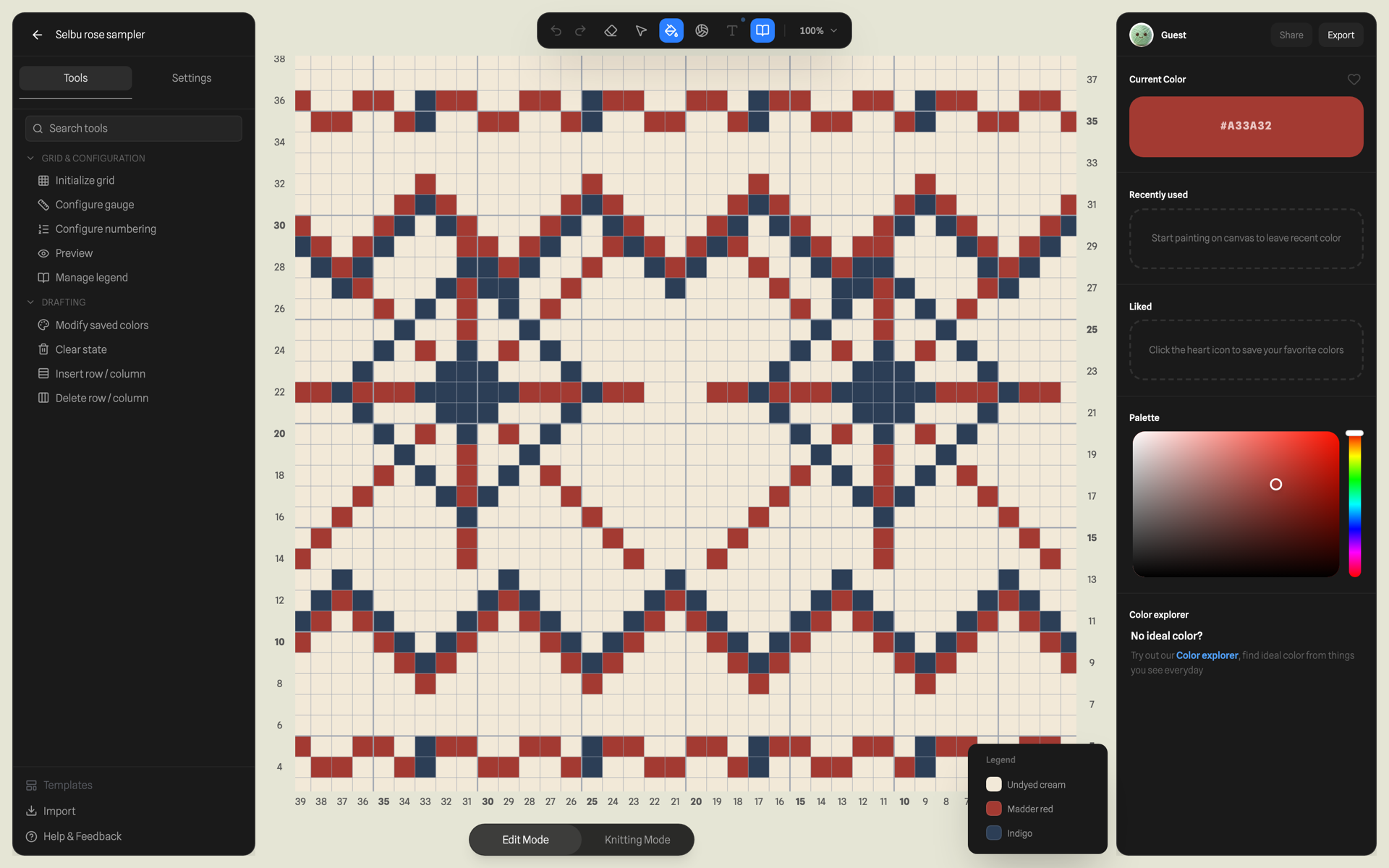
<canvas>; the legend at bottom right is built from whichever palette
entries the grid actually references.
The obvious representation for that grid is cells[row][col]. Chart Minder
stores it a cell at a time. The entire chart is one flat dictionary keyed by coordinate string:
type GridState = Record<string, CellState>; // "col,row" → cellinterface CellState { colorId?: string | null; symbolId?: string | null; symbolSpan?: { width: number; height: number }; // anchor of a multi-cell symbol symbolAnchorKey?: string; // child cell → its anchor's key}Three reasons, in order of how much they paid off:
- Charts are sparse. A 100×100 chart is 10,000 cells, and most of them
are background. The dictionary only stores stitched cells, so memory and iteration cost
scale with the pattern alone. The symbol render pass is
Object.entries(gridData)— its length is the stitch count itself. - It serializes as-is. The grid goes into
localStorage, into the undo stack, and into a D1TEXTcolumn as plain JSON. No encode/decode layer anywhere in the stack. - Structural edits are key rewrites. Where an array would move 10,000
elements, inserting a row rewrites the keys at or above the insertion point
(
"x,y"→"x,y+1") and leaves everything below untouched.
The interesting wrinkle is multi-cell symbols. Knitting notation lets one glyph own several cells: a cable crossing spans 3–4 columns, a slip stitch spans 2 rows. The dictionary models a symbol's footprint as an anchor cell that owns the symbol and its span, plus child cells that each point back at the anchor:
// a 2-wide decrease placed at (5,3):"5,3": { symbolId: 'decreaseleft.2w', symbolSpan: { width: 2, height: 1 } }"6,3": { symbolAnchorKey: '5,3' }
The renderer draws the full SVG once at the anchor; child cells know they're occupied and
skip the symbol pass. Any lookup that lands on a child follows symbolAnchorKey to
find what owns the square. It's a tiny doubly-linked structure, and it imposes an
invariant every mutation must preserve: a child must always resolve to a live
anchor. That invariant is what makes the next section more than a coordinate swap.
Flips and rotations as index arithmetic
Every area transform in the editor reduces to one pure function: remap a cell's position relative to the selection's local frame.
// transformGrid.ts — every area transform reduces to this one remap.// For 90° increments on a grid, the rotation matrix collapses into index// swaps: no trigonometry, no floats, nothing to round.function remapCoord(type, relC, relR, selW, selH) { switch (type) { case 'FLIP_H': return { newRelC: selW - 1 - relC, newRelR: relR }; case 'FLIP_V': return { newRelC: relC, newRelR: selH - 1 - relR }; case 'ROTATE_CW': return { newRelC: selH - 1 - relR, newRelR: relC }; case 'ROTATE_CCW': return { newRelC: relR, newRelR: selW - 1 - relC }; case 'ROTATE_180': return { newRelC: selW - 1 - relC, newRelR: selH - 1 - relR }; }}Two things complicate the clean version.
Non-square selections change shape. Rotating a 6×3 selection produces a
3×6 footprint, which has to land somewhere. The user picks a pivot (center, or one
of the four edges), and the new selection origin is solved so the pivot's relative position
is preserved: newMinCol = round(pivotC − (newW−1) · (pivotC − minCol)/(selW−1)).
The new footprint can now hang off the canvas, so the transform returns an overflow report
({top, right, bottom, left} in cells) and the caller resolves it with an
explicit policy: CLIP the overhang, AUTO_FIT by shifting
the result back inside, or REVERT the whole thing.
Symbols rotate as whole footprints. You can't remap a cable's four cells independently — the anchor is the footprint's top-left, and after a rotation the old anchor is usually not the new top-left. So the transform separates plain cells from symbols, remaps all four corners of each symbol's footprint, takes the bounding box of the remapped corners, and rebuilds the anchor there with the span's width and height swapped for 90° rotations. Children are rewritten to point at the new anchor key.
CLIP has its own symbol rule: if any cell of a symbol's span would be clipped, the entire symbol is removed, span and all — a cable missing one column reads as a different stitch, which is a lie in knitting notation. Orphaned children whose anchor got clipped are scrubbed in the same pass, which is exactly the anchor invariant paying for itself.
Two hundred full snapshots, on purpose
The original design doc called for command-pattern undo: store inverse-capable actions like
{ coord, from, to } and replay them backwards. What shipped is blunter
— two stacks of full project snapshots. That sounds wasteful until you put
numbers on it:
- A 40×40 chart is ~1,600 cells; a full snapshot serializes to roughly 20–50 KB.
- History is capped at 200 entries, so worst case is ~4–10 MB. A browser doesn't blink.
- Snapshots are spread-copied dictionaries, so consecutive entries share the unchanged cell objects. The real cost per entry is the delta plus one object header per key — far below the serialized size.
In exchange, undo is pop() — restoring a snapshot is exact every time, and every
feature added since (transforms, imports, palette edits) got correct undo for free, because
the snapshot is the only thing undo has to know about.
The part that needed actual design is batching. A pen stroke fires one state
update per cell crossed; without intervention a single drag becomes forty undo entries. The
hook exposes startBatch() / endBatch(): pointer-down opens a batch,
every update inside it mutates live state but only the first records the pre-stroke
snapshot, and pointer-up pushes exactly one entry for the whole gesture. If the component
unmounts mid-stroke the batch is silently discarded. A labelFn can also return
null to mark a change as cosmetic — it updates state but records nothing, so
toggling the legend never pollutes history.
Importing someone else's chart from a picture
The feature the old lady actually asked for — importing other people's charts — is the most
algorithmic part of the app. Input: a screenshot, photo, or PDF page render of a chart.
Output: rows, columns, and a colorId per cell. Arithmetic only — the whole
pipeline is signal processing on one getImageData pass:
Finding the grid is a 1-D problem. Grid lines are the strongest horizontal and vertical edges in the image, so the detector collapses the 2-D image into two profiles: for every column, sum the RGB difference between each pixel and its right neighbour; for every row, the same against the bottom neighbour. Grid lines show up as sharp peaks:
// imageImport.ts, compressed to the arithmetic. Two 1-D profiles stand in// for the 2-D image: grid lines are the strongest edges, so they show up as// peaks in the summed neighbour difference along each axis.const diffX = |R−R'| + |G−G'| + |B−B'|; // against the right neighbourcolEdges[x] += diffX; // one Float32Array per axisrowEdges[y] += diffY; // against the bottom neighbour// peaks: local maxima ≥ 15% of the profile max, > 3 px apart// cell size: the MEDIAN gap between consecutive peaks — not the meancols = round((lastPeak − firstPeak) / medianGap);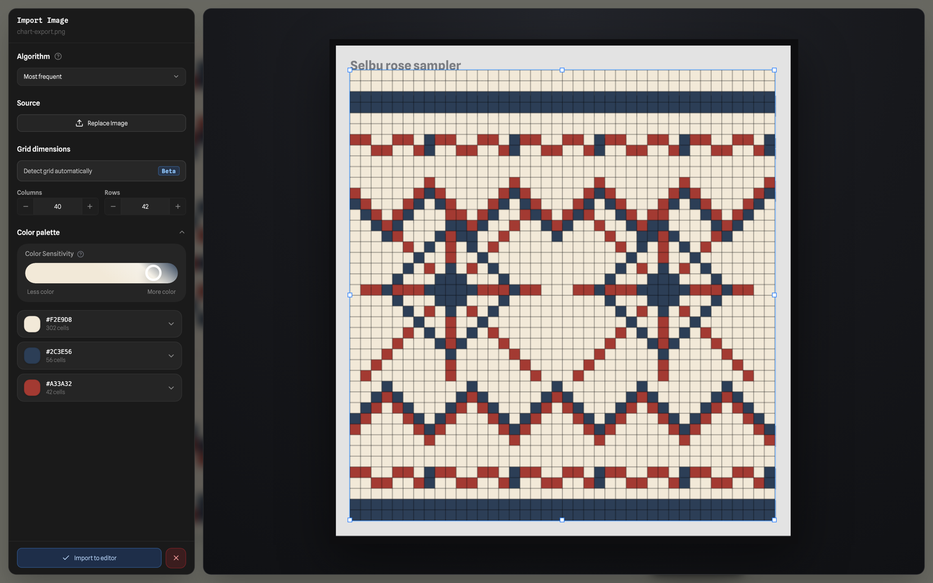
The median is the load-bearing choice. Real charts have bold every-5th lines, borders, and missed faint lines — the mean gap would be skewed by every gap a missed peak doubles, but the median shrugs them off. First and last peak give the crop rectangle; total span over median gap gives the count. If either axis yields fewer than three peaks or a sub-3-px spacing, detection declines and the user places the grid by hand — a wrong guess is worse than no guess.
Each cell votes on its color. Three sampling modes, picked per import: average (mean RGB of the cell's pixels — good for clean vector exports), center (one pixel — immune to grid-line bleed), and dominant (histogram mode over RGB bucketed to steps of 10 — the right answer for photos, where a cell is mostly its color plus noise and a dark grid line the average would smear in). Only pixels with alpha 10 and up get a vote, which is what keeps transparent PNG backgrounds out of the palette.
Clustering is greedy, and that's deliberate. Sampled colors then collapse
into families: walk the unique colors in descending frequency order; each either joins the
first existing family whose center is within a Euclidean RGB threshold, or founds a new
family. The user's sensitivity slider is the threshold —
(100 − sensitivity) × 2 — so at 100 every distinct color survives and at 0
nearly everything merges (RGB distances max out around 441). There's a textbook Lloyd's
k-means sitting in the utils for palette work, but the import path doesn't use it: k-means
needs k chosen up front, and its random initialization makes results twitch between
runs. The greedy pass discovers the family count on its own and is fully deterministic, so
dragging the sensitivity slider replays the exact same data and the preview moves smoothly
instead of reshuffling.
The importer gets a standalone write-up that derives all four stages with the arithmetic written out — the projection profiles and the median gap estimator, the three sampling estimators and why the histogram mode is the default, the leader algorithm doing the clustering k-means would be wrong for — with a worked example and references for where each method comes from: How a picture becomes a knitting chart.
One canvas, redrawn from state
The editor is a single <canvas> redrawn as a pure function of state —
there is no requestAnimationFrame loop; a useEffect repaints only
when something actually changed. Pan and zoom are pure view state: they're context
transforms (translate(center + pan) → scale(zoom)), so dragging the canvas
re-executes the same draw list under a different matrix. The backing store is scaled by
devicePixelRatio once per frame with setTransform, which is the
difference between crisp and blurry grid lines on every laptop screen.
Two decisions keep the redraw cheap at real chart sizes:
- Pattern repeats are stamps of one tile. Knitting patterns tile — a 20×20
motif repeated 5×3 across a shawl. Only the editable tile exists in
GridState; the other fourteen placements are re-draws of the same cells at offset origins, each clipped to its tile rect. Editing one cell updates all fifteen copies for free, and the fill pass stays O(tile) however big the shawl gets. - The two passes iterate different sets. Colors loop over the visible
tile's cells (dense, but bounded by the tile); symbols loop over the sparse dictionary
entries and draw the ones carrying a
symbolId. Symbol SVGs are recolorable at draw time by rendering the glyph to a scratch canvas and compositing the user's symbol color throughsource-in— one mask, any palette, no pre-tinted asset set.
The same file also hides the domain's coordinate weirdness. Knitting charts are numbered
right-to-left and bottom-to-top, and flat knitting alternates direction every row because
the knitter physically turns the work. All of that lives in one visualToData /
dataToVisual pair — knitting conventions stop at that boundary, and
every algorithm above works in plain top-left coordinates.
Saving without a save button
Nobody counting stitches wants to remember to save. Persistence is a pipeline that fires on every edit, with each layer on its own debounce:
The detail that took tuning: debounces are suppressed mid-gesture. While a
stroke is active, the schedulers mark work as pending and defer their timers — serializing a
few-hundred-KB project between pointer events is exactly how you make a pen stutter.
Pointer-up ends the undo batch and releases both schedulers at once. A pagehide
listener flushes anything still pending, so closing the tab mid-doodle loses at most nothing
— the flush is synchronous into localStorage.
Cloud saves get a second gate: a content fingerprint. Every project serializes to a canonical string, and a save only goes out if the fingerprint moved:
// projectLibraryStorage.ts. Keys are sorted because dictionary order follows// insertion history: two grids with identical cells painted in a different// order must fingerprint the same. Timestamps are excluded because this also// decides whether a save is allowed to bump updatedAt.function projectContentFingerprint(p: ChartProject): string { const grid = Object.keys(p.gridData).sort().map((k) => [k, p.gridData[k]]); // + sorted palette, settings, dimensions, title — but never timestamps return JSON.stringify({ meta, dimensions, settings, palette, grid, outlines });}
Sorting matters because dictionary key order depends on insertion history: two grids with
identical cells painted in a different order must fingerprint identically. Excluding
timestamps matters for a subtler reason — the fingerprint also decides whether a save
bumps updatedAt. Without that, every no-op sync would touch the
timestamp, and the library's "recently edited" ordering would be fiction.
Each project gets its own save timer in a keyed map, so editing chart A never delays chart B's save, and a redundant PUT can't pile up behind a real one.
Concurrency for a party of one
One person per document — and the concurrency problems are the single-user kind, which are less famous but still real: two tabs open on the same chart, a laptop and a phone, and the big one — edits made offline that meet the cloud again later.
The reconnect sync is where all the earlier pieces converge. On sign-in or network recovery, the client loads the local library, fetches the cloud library, and merges with the cloud as base. For each local record it builds a comparable snapshot — and here the hydration order matters: the freshest local edits live in the session store, ahead of the library record, so the local side is hydrated session-first before comparing. Records whose snapshots differ from the cloud's become sync candidates; each is re-checked with the fingerprint against the cloud copy (skip if content-identical), then pushed as a whole-document PUT. Conflict resolution is last-write-wins with the local copy preferred — for one knitter across devices, "the version I just edited wins" is exactly the right spec. CRDTs would add a merge lattice to resolve conflicts between a user and themselves.
The guards around this sync are small but load-bearing:
- Single-flight: the sync stores its promise in a ref and returns the in-flight one to any caller who asks again, so "came online" + "clicked retry" + "signed in" can't race three merges.
- Identity pinning: every async save captures the user id at schedule time and aborts if the signed-in user changed by fire time — the sign-out-mid-debounce race would otherwise write user A's chart into user B's library.
- Server-side backstop: the Worker rate-limits writes at 300/min keyed by
userId:path, so a client bug that floods PUTs degrades into 429s instead of a bill.
A document store in a relational coat
The Worker's job is deliberately boring: verify a Clerk JWT at the edge (local key, no auth-server round trip), scope everything to the user, move JSON in and out of D1. The schema is three tables, and the projects table shows the pattern:
CREATE TABLE projects ( id TEXT PRIMARY KEY, user_id TEXT NOT NULL, folder_id TEXT, title TEXT NOT NULL, project_json TEXT NOT NULL, -- the whole chart document workspace_json TEXT, source_asset_id TEXT REFERENCES assets(id), created_at TEXT NOT NULL, updated_at TEXT NOT NULL, trashed_at TEXT);CREATE INDEX idx_projects_user_updated ON projects(user_id, updated_at);
The chart itself is an opaque project_json blob — the server never queries
inside a grid, so decomposing cells into rows would buy nothing and cost a serialization
layer. Everything the server does query — title, folder, timestamps, trash state —
is promoted to real columns with composite indexes that all lead with user_id.
Every query in the repository starts WHERE user_id = ?; tenant isolation is
enforced at the query level, in every statement, with the indexes shaped to match.
Around that core, a few choices worth stealing:
- Original files live in R2, addressed for cleanup. Imported PDFs and images
go to R2 under
users/{uid}/projects/{pid}/{assetId}-{filename}with a SHA-256 checksum recorded in D1 — the DB row is the source of truth, the key layout makes orphan cleanup a prefix listing, and serving them back out is R2's zero-egress. - The migration endpoint is idempotent by construction. Importing a legacy
local library uses
INSERT OR IGNOREplus existence checks, and each project's source PDF gets a deterministic asset id (asset-{projectId}-source). Run the import twice — because the first response timed out, say — and the second run is a no-op instead of a duplicate library. - The trash empties itself. Deleting is
trashed_at = now(); anything older than 30 days is purged lazily the next time that user loads their library. For per-user data with no cross-user deadlines, piggybacking cleanup on reads deletes the entire scheduling problem.
What the old lady got
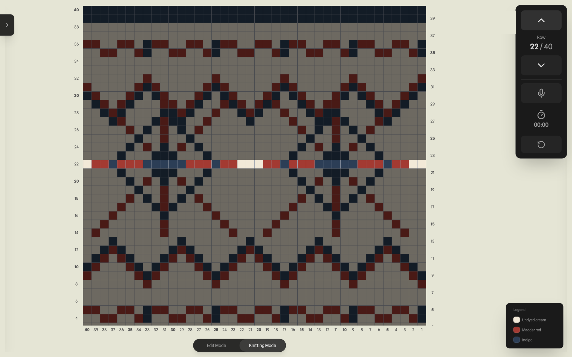
The part of the spec that sounds least technical — "track knitting progress" — is the reason the architecture holds together. Tracking mode flips the whole editor into a locked phase: mutations disabled, a focus overlay on the current row, one counter moving bottom-to-top the way the chart is actually knitted. It works as a mode switch precisely because the state was built as one serializable document with every convention isolated behind a mapping function — the tracker is just another reader of the same dictionary.
Every piece above is ordinary. A sparse dictionary, index arithmetic, snapshot stacks, edge profiles and a median, debounced writes behind a fingerprint, LWW sync with the races pinned shut, JSON in SQLite on a Worker. The craft is in how little of it the person holding the needles ever has to think about — which, for once, is a spec written by the actual user.